

This chart shows how much electronics was generated in America by weight, how much electronics were collected for recycling, and how much of those collected for recycling were exported.
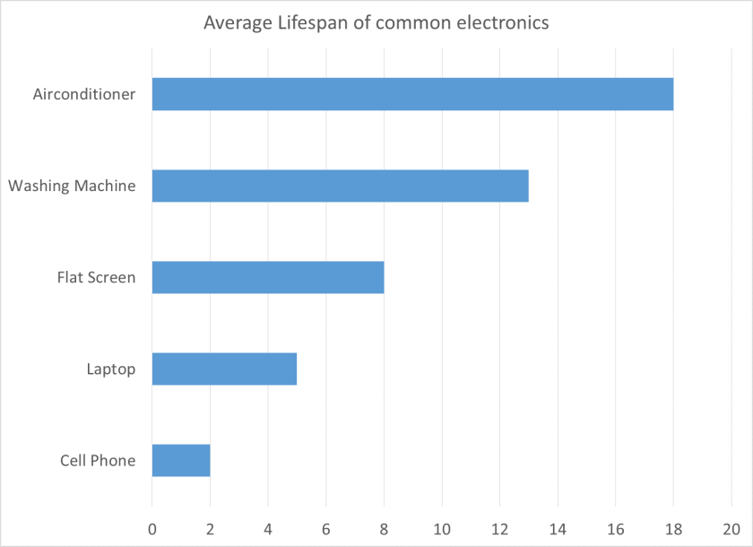
This chart shows the average lifespan of common consumer electronics, and shows how the bigger the electronic is the longer it will usually last.

This chart shows the amount of e-waste generated and how much is trashed compared to how much is recycled, and shows how less and less is getting trashed and more is getting recycled.
